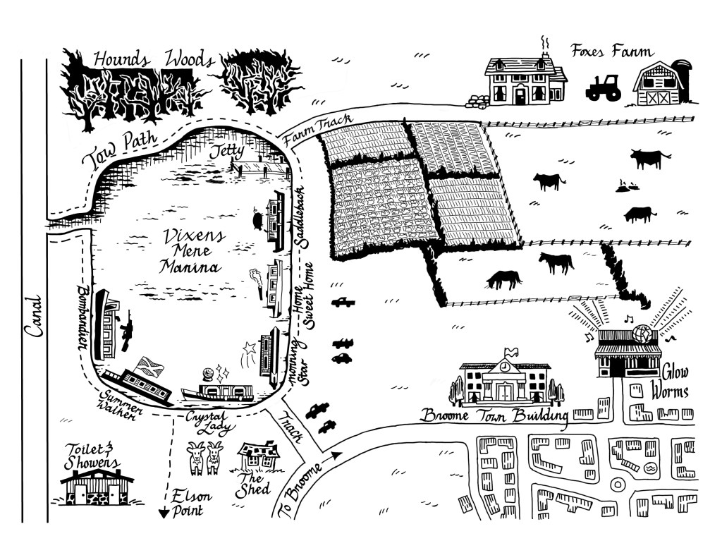
Thanks to my Med Bow Peak pen & ink drawing, I was commissioned to create a fictional map for Inkspot Publishing’s upcoming book, Under Vixens Mere. The map depicts Vixens Mere, a lake that hosts six houseboats, and its surrounding areas. I was given a lot of agency with the artistic style, but was handed specific reference photos for the boats.
I documented the entire process behind learning cartography, posted to Inkspot’s blog. However, I wanted to write a separate post to explain the process behind creating the houseboat illustrations from reference photos.
Challenges:
- The houseboat images were taken from different angles, not all from side profile views. In the final map, I needed to have uniform side profiles for each houseboat.
- The boat illustrations were limited to about 2 cm long, so I needed to remove unnecessary detail while maintaining differentiable shapes & features for each boat.
- I have never drawn a houseboat before, so my first few sketches were less than perfect. My first houseboat looked more like a yacht!
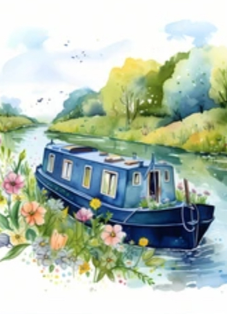
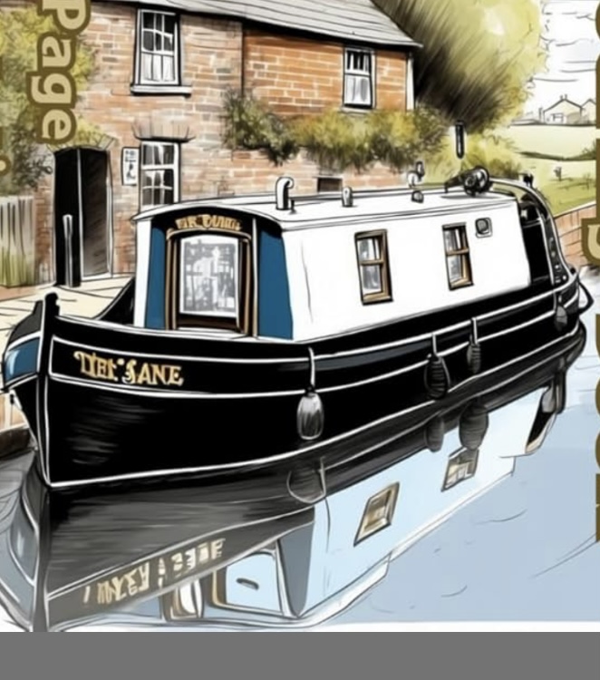
Starting with “Home Sweet Home” (#1)
As this was my first houseboat, I needed to sketch this one a few times. The first few times were just getting an idea of proportions and details to add, and then testing to see how it looked with pen. It looks more and more like a houseboat as I continued to sketch, but my main error here was scale. I was sketching this boat much larger than it would appear on the final printed version, so the details added were far too fine to keep in the final draft.
Reference image:
Sketches:
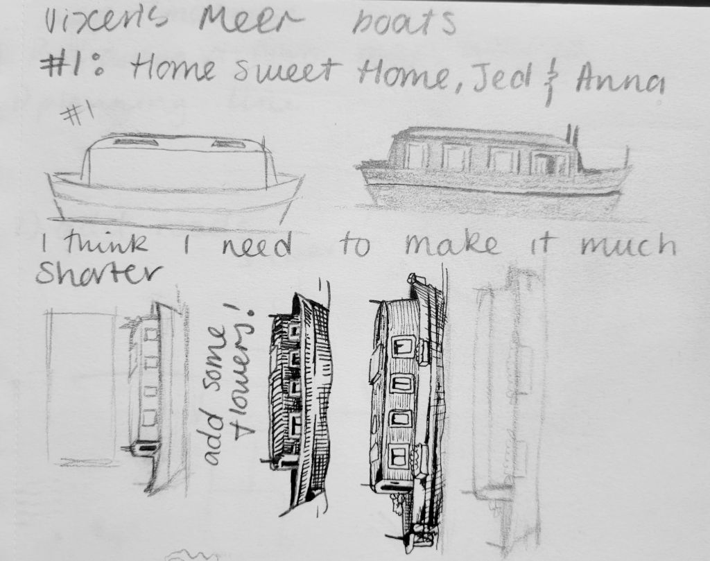
Here is the final version used. It lost a lot of the detail, but I managed to maintain the windows and some of the distinguishing poles.

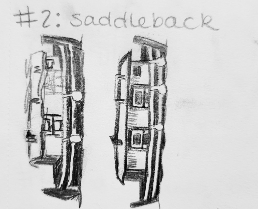
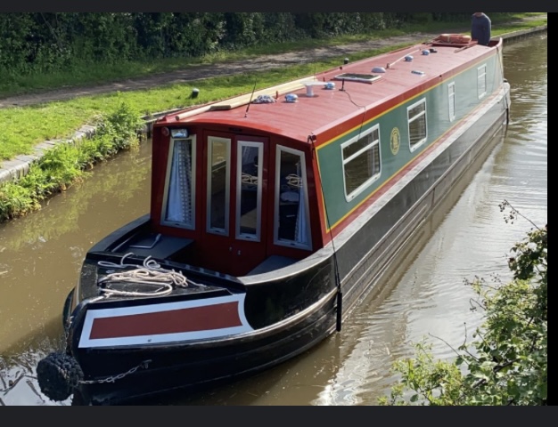
Saddleback (#2)
The Saddleback houseboat only needed two sketches before I was comfortable putting it on the map. My process was already 3 times as efficient! Again, the pencil sketch was too big, so it lost some detail in the final version.
Reference image:
Sketches:
Final Version:

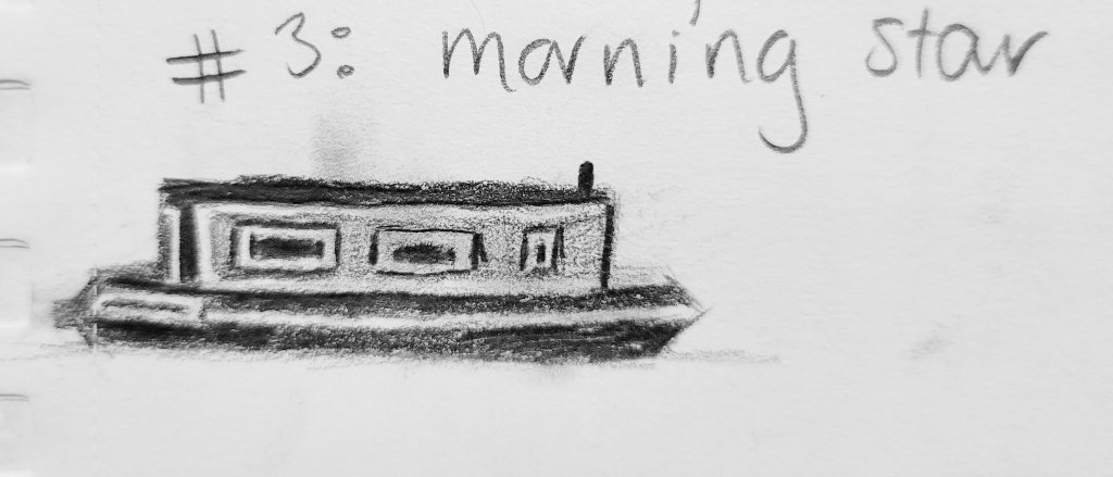
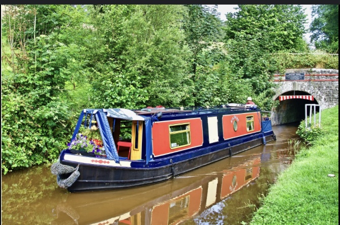
Morning Star (#3)
Now that I had a better idea for the general proportions I wanted to follow for the boats, I focused on the features of the reference picture that I wanted to bring in to the final version
Reference Image:
Sketch:
Final Version:

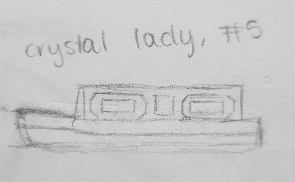
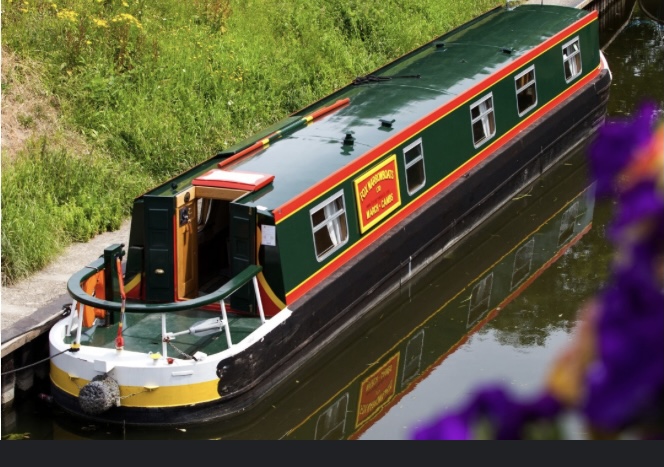
Crystal Lady (#5)
I don’t remember why I did Crystal Lady before Summer Walker, but I didn’t follow the numeric order when planning out how I wanted to draw the boats…
I grew more comfortable with the sketch being just a sketch without too many details, trusting myself to add the important details and values in the final version.
Reference Image:
Sketch:
Final Version:

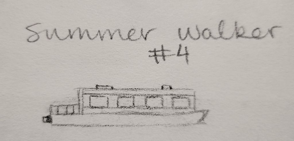
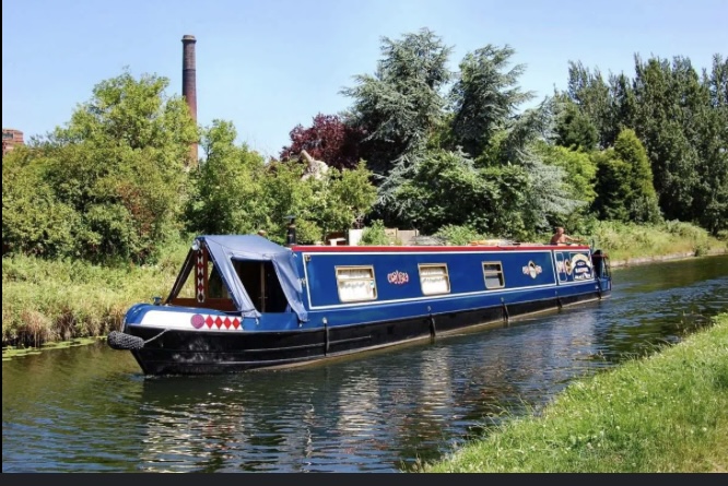
Summer Walker (#4)
Summer Walker is my most confident-looking concept so far! I just did the outline, and made it much smaller than my other sketches so that I wouldn’t need to remove too much detail in the later stages. The final stage came out a bit slanted compared to the initial sketch.
Reference Image:
Sketch:
Final Version:

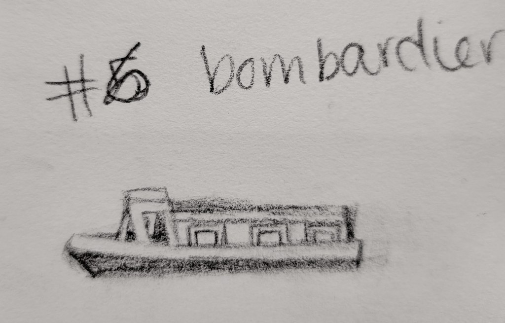
Bombardier (#6)
I love looking at the subtle improvement with each sketch. My Bombardier sketch is quite clearly the best concept sketch. It’s small, not too complicated, and was really easy to improve upon. Whereas the earlier sketches needed a complete re-doing digitally.
Reference:
Sketch:
Final Version:

Progression
- My confidence and grasp improved with each boat I drew, doing fewer sketches each time to achieve a concept. Making the concept sketches much smaller in the final two practice rounds also made the translation process much easier.
- Although my complete pen & ink map that I submitted has varying shapes for the houseboats, I was able to flatten the ones that looked too yacht-like in the digitizing process. The outcome is a uniform set of boats, all around the same length and height, but with vastly different personalities!
To learn more about the entire map making process, read my blog post on Inkspot.com!
Final Preliminary Map:

